Modified : 06 Jun 2022
What is a Website heatmap
A website heat map is a concept of identifying hotspots on a webpage. Deducing this kind of information is very helpful optimizing a website. The idea is to place right content in right places of website.
How does it help?
Different users interact with a website differently, some might scroll down and some don't. The user might leave the page too quickly or without interacting at all. The reasons could be
- Right content not found
- Interactive elements not present
- Bad design
- No graphics
A website is basically your salesman and if you don't present it well, then there is no point in having one. What we are going to discuss here is really important because you could have your website on the most fastest platform, all bells and whistles but still don't reach enough audience.
Identify hotspots
Lets discuss with the help of these three design examples.
Design 1
Look at this design, the navbar is right aligned and a large heading is in the center of the page followed by the "Get Started" button. The user's focus is marked by a red cloudy overlay. This is the place where I suggest using the right content.
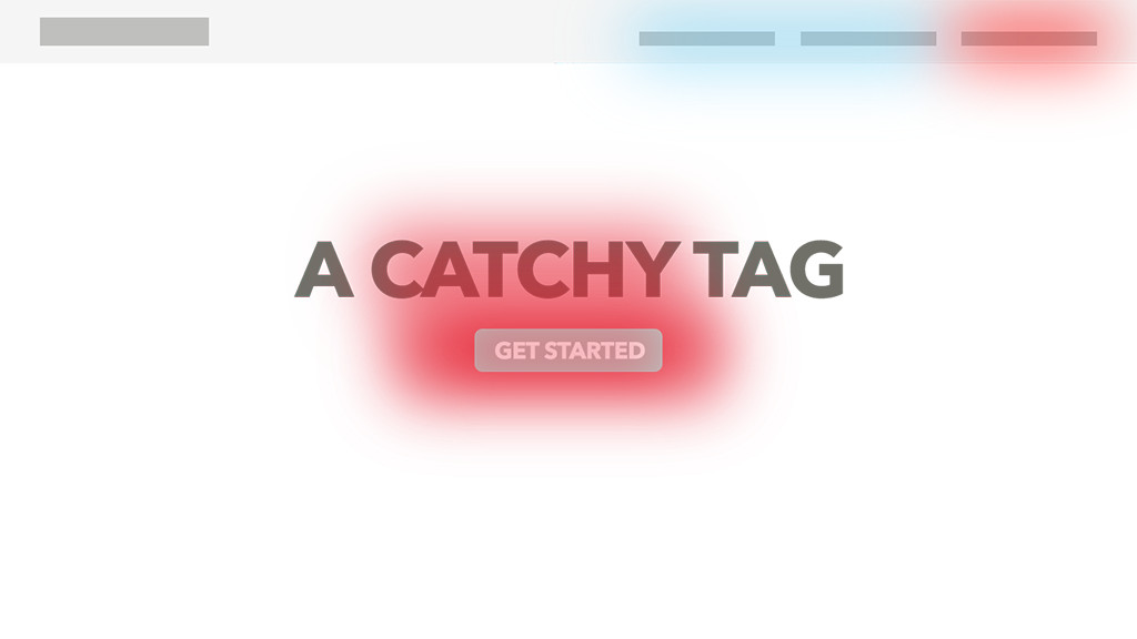
For example, if you have a service based website like roofing, webhosting, alarm etc and you would like users to signup right away, then this kind of website design helps alot. Because users are interactive hungry and this button placed at right place will usher the user to the signup or service page
Design 2
This design is best suited to promote brands. The navigation bar features a centered nav where the company logo sits. Followed by, a heading and a para on left and graphics on the right. You want to tell the user what kind of site it is at very first impression. The heading "Visitor management" does that precisely and is very hot. The first few words of para is hot and you would want to hook the user with catchy or intriguing words such as "free", "convert", "ask", "find out" etc.
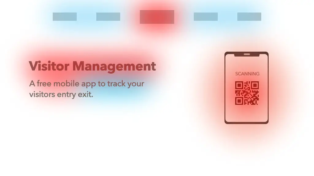
Coming to the graphics, its the second thing the user notices and it should tell the user what we are offering. Dont use generic images. Design one that double downs on the adjacent heading and para. In this example, I've a mobile phone doing the scanning. The user immediately understand that this is some kind of mobile app that works on QR code scanning. And its precisely that!
Design 3
This design commonly feature in blog posts, news websites etc.. and this website too! Blog posts usually have 2/3 of the page filled with content and 1/3 for sidebar. The sidebar might consist of ads, featured posts, previous posts other non trivial but accesible links
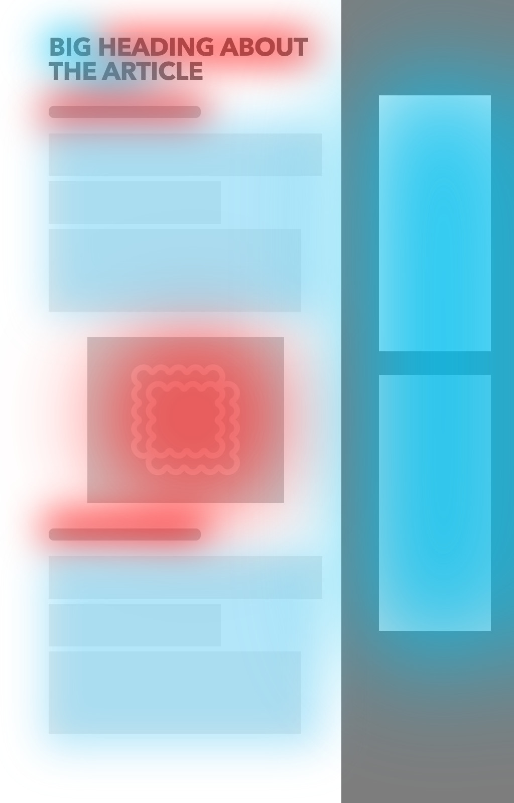
Heading and images found throughout the page are always hot. If you are a full time blogger and rely on the ads, then utilize the area inbetween content to show the ads.
Conclusion
Let us know which design your website has and whats your painpoints. If you are not using these techniques, then do it right away and start measuring the user conversion. I would like to hear about it if you do. Post your comments below in the comment section.
Post a comment
Comments
Recent Posts

Webcam to CCTV
Do you want to access your webcamera remotely? Then this article is for you.
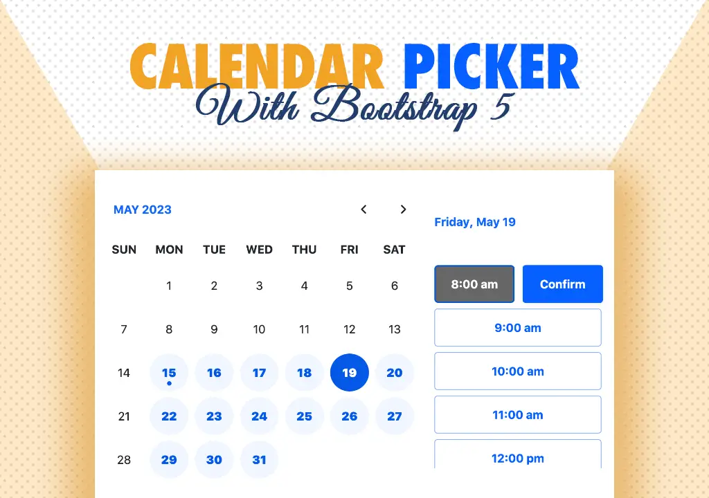
Calendar Picker
Calendar Picker / Appointment Setter JS CSS Library. Inspired by Calendly.

File Sharing Server
Create a local file sharing server with realtime sync feature using Socket IO.

Tailwind Navbars
Most beautiful Navbars designed with tailwind css. Fully responsive templates.
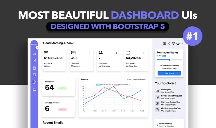
Dashboard UIs
Most beautiful dashboards designed with bootstrap 5. Inspired mostly from dribble and other sources.

HTML Email Tempaltes
Most commonly used HTML email templates. Welcome email, sign up, password reset etc.
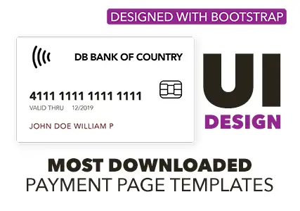
Payment Page UI
Checkout our most downloaded payment page ui designed with bootstrap.
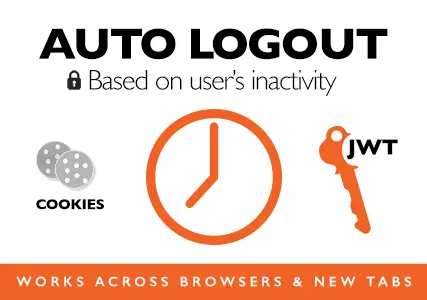
Auto Logout Feature
Detect user's inactivity and auto logout after certain timeout using various JS features.

HTML Popups
Keep the user engaged and gain recurring website traffic. Includes templates.
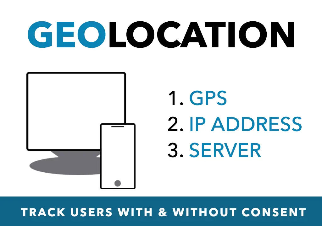
Geolocation
How to get a user's location using Javascript and other techniques available today.
Recent Utilities
- Numerology Calculator
- Invoice Builder
- Chatbot Builder
- QR Tickets
- WPNavbars
- Schema Generator
- Loading shimmer
- Day Planner
- Image Resizer
 Cookie Consent