 Siva Kishore G
Modified : 02 May 2023
Login Page Bootstrap 5 Templates
These are some of my best collection of most beautiful login screen html templates. Assuming you already imported bootstrap 5 and font awesome icons library
These are only HTML & CSS codes. Check out the form submission code here
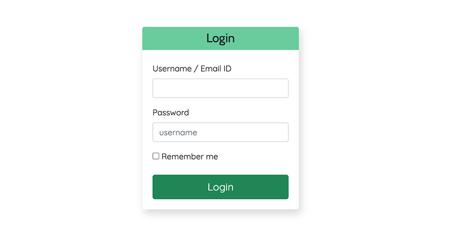
1. Page Centered
This login form is centered on page using CSS. Consider bootstrap's sticky navbar when implemneting this. Otherwise, adjust the margin value of .formContainer as per your requirement.
View code
<div class="p-4">
<div class="container">
  <div class="row">
    <div class="col-md-5 col-sm-6 col-lg-3 mx-auto">
      <div class="formContainer">
        <h2 class="p-2 text-center mb-4 h4" id="formHeading">Login</h2>
        <form action="#">
          <div class="form-group mt-3">
            <label class="mb-2" for="username">Username / Email ID </label>
            <input class="form-control" id="username" name="username" type="email" />
          </div>
          <div class="form-group mt-3">
            <label class="mb-2" for="password">Password</label>
            <input class="form-control" id="password" name="password" placeholder="username" />
          </div>
          <div class="mt-3">
            <input type="checkbox" /> Remember me
          </div>
          <button class="btn btn-success btn-lg w-100 mt-4">Login</button>
        </form>
      </div>
    </div>
  </div>
</div>
</div>
.formContainer {
box-shadow : 4px 8px 16px #d7d7d7;
margin:20vh auto;
padding:20px;
border-radius:0px 0px 4px 4px;
}
input {
box-shadow:none !important;
outline:none;
}
#formHeading {
background:#63cd9c;
margin:-20px;
border-radius:4px 4px 0px 0px
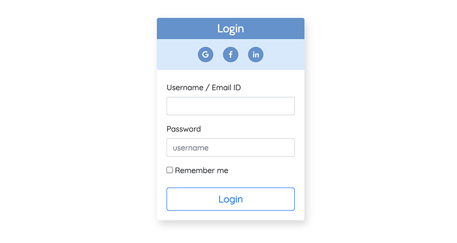
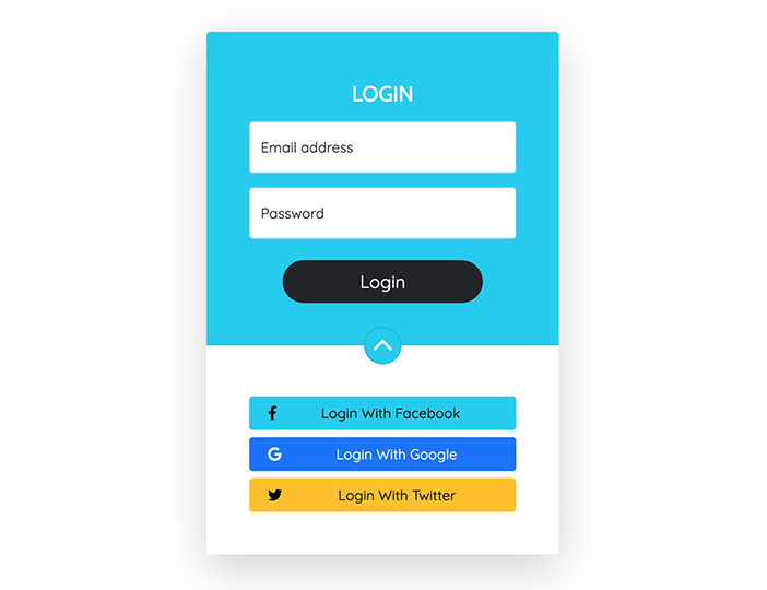
}2. Login with social media
There are times where you want your users to signup quickly with using their already established social media accounts. This UI will put more emphasis on that.
View code
    <div class="p-4">
<div class="container">
  <div class="row">
    <div class="col-md-5 col-sm-6 col-lg-3 mx-auto">
      <div class="formContainer">
        <h2 class="p-2 text-center text-white h4" id="formHeading">Login</h2>
        <div class="py-2 mb-4 text-center" id="loginWithPanel">
          <span class="loginWithIcon"><i class="fab fa-google"></i></span>
          <span class="loginWithIcon"><i class="fab fa-facebook-f"></i></span>
          <span class="loginWithIcon"><i class="fab fa-linkedin-in"></i></span>
        </div>
        <form action="#">
          <div class="form-group mt-3">
            <label class="mb-2" for="username">Username / Email ID </label>
            <input class="form-control" id="username" name="username" type="email" />
          </div>
          <div class="form-group mt-3">
            <label class="mb-2" for="password">Password</label>
            <input class="form-control" id="password" name="password" placeholder="username" />
          </div>
          <div class="mt-3">
            <input type="checkbox" /> Remember me
          </div>
          <button class="btn btn-outline-primary btn-lg w-100 mt-4">Login</button>
        </form>
      </div>
    </div>
  </div>
</div>
</div>
    .formContainer {
  box-shadow : 4px 8px 16px #d7d7d7;
  margin:15vh auto;
  padding:20px;
  border-radius:0px 0px 4px 4px;
}
input {
  box-shadow:none !important;
  outline:none;
}
#formHeading {
  background:#6391cd;
  margin:-20px -20px 0px -20px;
  border-radius:4px 4px 0px 0px
}
.loginWithIcon {
  font-size:14px;
  height:32px;
  width:32px;
  background:#6391cd;
  margin:8px;
  line-height:32px;
  display:inline-block;
  border-radius:32px;
  text-align:center;
  color:#fff
}
#loginWithPanel {
  background:#d8e8fd;
  margin:auto -20px;
}
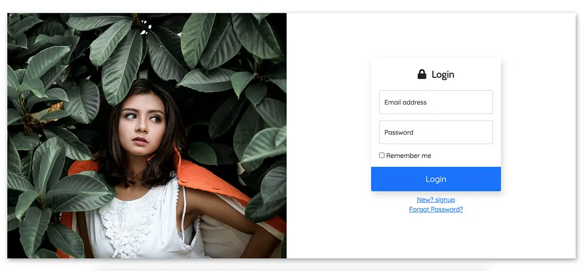
3. Two Columns
This is best suited to promote your products while user tries to login. This page show a full height graphics on the left column on screens upto 767px and shows only the login screen for mobile and tablet devices. Adjust the breakpoints to your wish with @media queries as shown in the css code below
View code
<div id="mainContainer">
  <div class="">
  <div class="row align-items-center">
    <div class="col-lg-6 col-md-6 col-xs-12 d-none d-lg-block d-md-block">
      <div id="mainBgn"></div>
    </div>
    <div class="col-lg-6 col-md-6 col-xs-12">
      <div class="p-4 centerOnMobile" >
        <div class="formContainer">
          <h2 class="p-2 h4 text-center"><i class="fas fa-lock me-2"></i> Login</h2>
          <form action="#">
            <div class="form-floating my-3">
              <input type="email" class="form-control" id="floatingInput" placeholder="name@example.com">
              <label for="floatingInput">Email address</label>
            </div>
            <div class="form-floating">
              <input type="password" class="form-control" id="floatingPassword" placeholder="Password">
              <label for="floatingPassword">Password</label>
            </div>
            <div class="mt-3">
              <input type="checkbox" /> Remember me
            </div>
            <div id="btnHolder">
              <button class="btn btn-lg btn-primary mt-3 w-100">Login</button>
            </div>
          </form>
        </div>
        <div class="mt-2 text-center">
          <a href="#">New? signup</a><br />
          <a href="#">Forgot Password?</a>
        </div>
      </div>
    </div>
  </div>
  </div>
  </div>
.formContainer {
max-width:320px;
box-shadow : 4px 8px 16px #d7d7d7;
margin:0 auto;
padding:20px;
border-radius:0px 0px 4px 4px;
}
input {
box-shadow:none !important;
outline:none;
}
#btnHolder {
margin:0px -20px -20px -20px;
}
#btnHolder .btn {
border-radius:0px 0px 4px 4px !important;
height:60px;
}
@media screen and (max-width:766px){
.centerOnMobile {
margin : 20vh auto
}
}
@media screen and (min-width:767px){
#mainBgn {
background : url('replace this with your image path') no-repeat;
background-size:cover;
background-position:center;
height:90vh;
width:100%;
}
#mainContainer {
box-shadow : 2px 4px 12px rgba(0,0,0,0.4);
height:90vh;
margin: 5vh 20px;
}
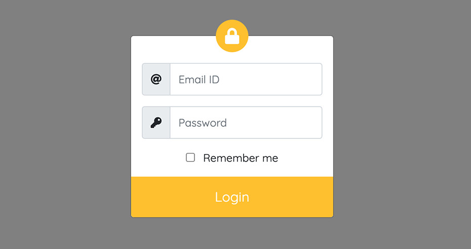
}4. Login Popup
This screen will show a vertically centered login which pops up upon clicking a button. For more info see, bootstrap's modal on how to trigger it in multiple ways. The user can click outside to dismiss the popup.
View code
<div class="modal" id="popupLogin" tabindex="-1">
  <div class="modal-dialog modal-sm modal-dialog-centered">
  <div class="modal-content">
    <div class="modal-body">
      <div class="" >
        <div class="">
          <div id="brandLogoOuter">
            <div id="brandLogoInner">
              <i class="fas fa-lock"></i>
            </div>
          </div>
          <form action="#">
            <div class="input-group my-3">
              <span class="input-group-text"><i class="fas fa-at"></i></span>
              <input class="form-control" placeholder="Email ID" name="username" id="username" type="email" />
            </div>
            <div class="input-group my-3">
              <span class="input-group-text"><i class="fas fa-key"></i></span>
              <input class="form-control" placeholder="Password" name="password" id="password" type="password" />
            </div>
            <div class="mt-3 text-center">
              <input type="checkbox" class="me-2" /> Remember me
            </div>
            <div id="btnHolder">
              <button class="btn btn-lg btn-warning text-white mt-3 w-100">Login</button>
            </div>
          </form>
        </div>
      </div>
    </div>
  </div>
  </div>
  </div>
input {
box-shadow:none !important;
outline:none;
}
input.form-control {
height:48px;
}
#btnHolder {
margin:0px -16px -16px -16px;
}
#btnHolder .btn {
border-radius:0px 0px 4px 4px !important;
height:60px;
}
#brandLogoOuter {
margin-top:-40px;
}
#brandLogoInner {
font-size:24px;
width:48px;
height:48px;
line-height:48px;
border-radius:50%;
background : #ffc108;
text-align:center;
color:#fff;
margin: 0 auto;
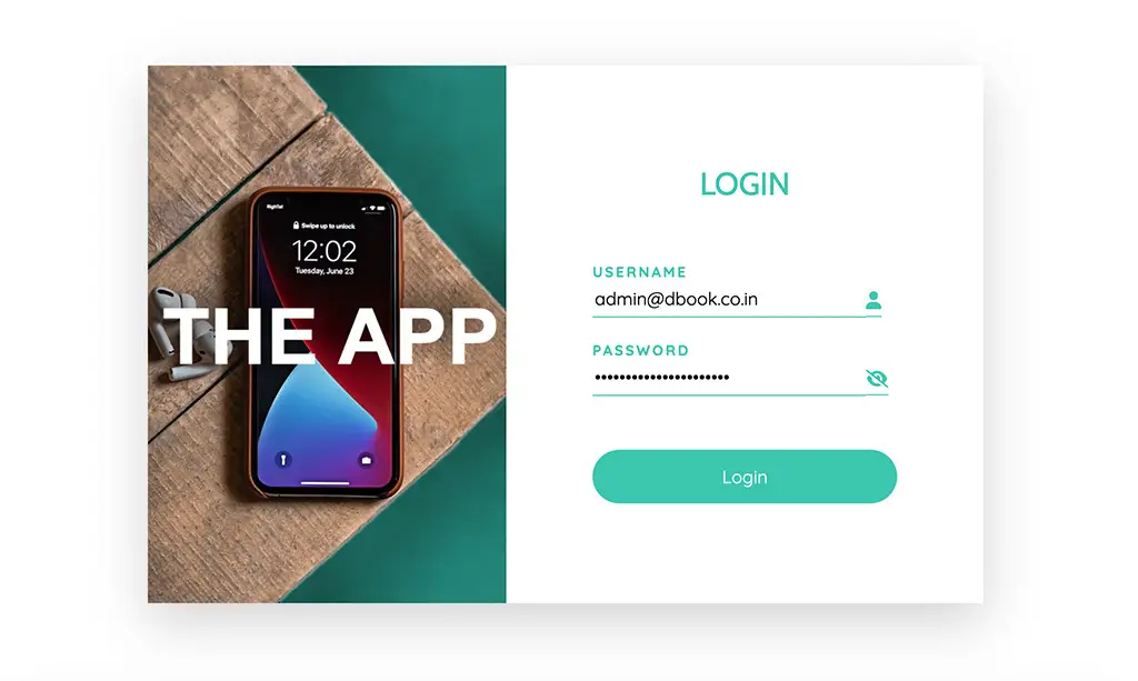
}5. Modern
A page centered modern login form with two columns. Left featuring the company graphics and right with the actual form. Fully mobile resposive that shows only the form at smaller displays.I've also added the login to mask and unmask the password field when the eye icon is clicked.
View code
<div class="min-vh-100 d-flex align-items-center">
  <div class="container">
    <div class="row">
      <div class="col-sm-7 mx-auto">
        <div class="shadow-lg">
          <div class="d-flex align-items-center">
            <div class="d-none d-md-block d-lg-block">
              <img src="/static_files/images/html/thApp.jpg" class="objectFit"  />
            </div>
            <div class="p-4" id="formPanel">
              <div class="text-center mb-5">
                <h1 class="customHeading h3 text-uppercase">Login</h1>
              </div>
              <form onsubmit="event.preventDefault();submitForm()">
                <div class="custom-form-group">
                  <label class="text-uppercase" for="username">Username</label>
                  <input type="text" id="username" class="pb-1" /><span class="pb-1"><i class="fas fa-user"></i></span>
                </div>
                <div class="custom-form-group mt-3">
                  <label class="text-uppercase" for="password">Password</label>
                  <input type="password" id="password" class="pb-1" /><span class="pb-1"><i id="showCursor" class="fas fa-eye-slash" onclick="showPassword(event)"></i></span>
                </div>
                <div class="mt-5">
                  <button class="w-100 p-2 d-block custom-btn" >Login</button>
                </div>
              </form>
            </div>
          </div>
        </div>
      </div>
    </div>
  </div>
</div>
.customHeading {
color:#30c6b0;
}
.custom-form-group label {
color:#30c6b0;
font-size:13px;
font-weight:bold;
letter-spacing:2px;
}
.custom-form-group span {
width:32px;
border-bottom:1px solid #30c6b0;
vertical-align:middle;
color:#30c6b0;
display:inline;
}
.custom-form-group input {
width : calc(100% - 32px);
border:none;
border-bottom:1px solid #30c6b0;
box-sizing:content-box;
outline:none;
}
.custom-btn {
border-radius:32px;
background : #30c6b0;
border:2px solid transparent;
color:#fff;
height:48px;
}
.custom-btn:hover {
background : #fff;
border:none;
border:2px solid #30c6b0;
color:#30c6b0;
}
#formPanel {
min-width:280px;
max-width:320px;
width:100%;
margin:0 auto;
}
.objectFit {
object-fit:cover;
width:100%;
max-width:320px;
min-height:60vh;
margin:0 auto
}
#showCursor {
cursor:pointer
} function showPassword(e){
var input = document.getElementById('password')
if(input.type === 'password'){
input.type = "text"
e.target.className = "fas fa-eye"
}else{
input.type = "password"
e.target.className = "fas fa-eye-slash"
}
}
6. Social Drawer
A page centered single column form with a collapsible section for social login links. Fully mobile resposive. The chevron rotates according to the status of the drawer.
View code
<div class="min-vh-100 d-flex align-items-center">
  <div class="container">
    <div class="row">
      <div class="col-sm-7 mx-auto">
        <div class="shadow-lg">
          <div class="d-flex align-items-center">
            <div class="d-none d-md-block d-lg-block">
              <img src="/static_files/images/html/thApp.jpg" class="objectFit"  />
            </div>
            <div class="p-4" id="formPanel">
              <div class="text-center mb-5">
                <h1 class="customHeading h3 text-uppercase">Login</h1>
              </div>
              <form onsubmit="event.preventDefault();submitForm()">
                <div class="custom-form-group">
                  <label class="text-uppercase" for="username">Username</label>
                  <input type="text" id="username" class="pb-1" /><span class="pb-1"><i class="fas fa-user"></i></span>
                </div>
                <div class="custom-form-group mt-3">
                  <label class="text-uppercase" for="password">Password</label>
                  <input type="password" id="password" class="pb-1" /><span class="pb-1"><i id="showCursor" class="fas fa-eye-slash" onclick="showPassword(event)"></i></span>
                </div>
                <div class="mt-5">
                  <button class="w-100 p-2 d-block custom-btn" >Login</button>
                </div>
              </form>
            </div>
          </div>
        </div>
      </div>
    </div>
  </div>
</div>
.customHeading {
color:#30c6b0;
}
.custom-form-group label {
color:#30c6b0;
font-size:13px;
font-weight:bold;
letter-spacing:2px;
}
.custom-form-group span {
width:32px;
border-bottom:1px solid #30c6b0;
vertical-align:middle;
color:#30c6b0;
display:inline;
}
.custom-form-group input {
width : calc(100% - 32px);
border:none;
border-bottom:1px solid #30c6b0;
box-sizing:content-box;
outline:none;
}
.custom-btn {
border-radius:32px;
background : #30c6b0;
border:2px solid transparent;
color:#fff;
height:48px;
}
.custom-btn:hover {
background : #fff;
border:none;
border:2px solid #30c6b0;
color:#30c6b0;
}
#formPanel {
min-width:280px;
max-width:320px;
width:100%;
margin:0 auto;
}
.objectFit {
object-fit:cover;
width:100%;
max-width:320px;
min-height:60vh;
margin:0 auto
}
#showCursor {
cursor:pointer
} function showPassword(e){
var input = document.getElementById('password')
if(input.type === 'password'){
input.type = "text"
e.target.className = "fas fa-eye"
}else{
input.type = "password"
e.target.className = "fas fa-eye-slash"
}
}
7. Multistep Login
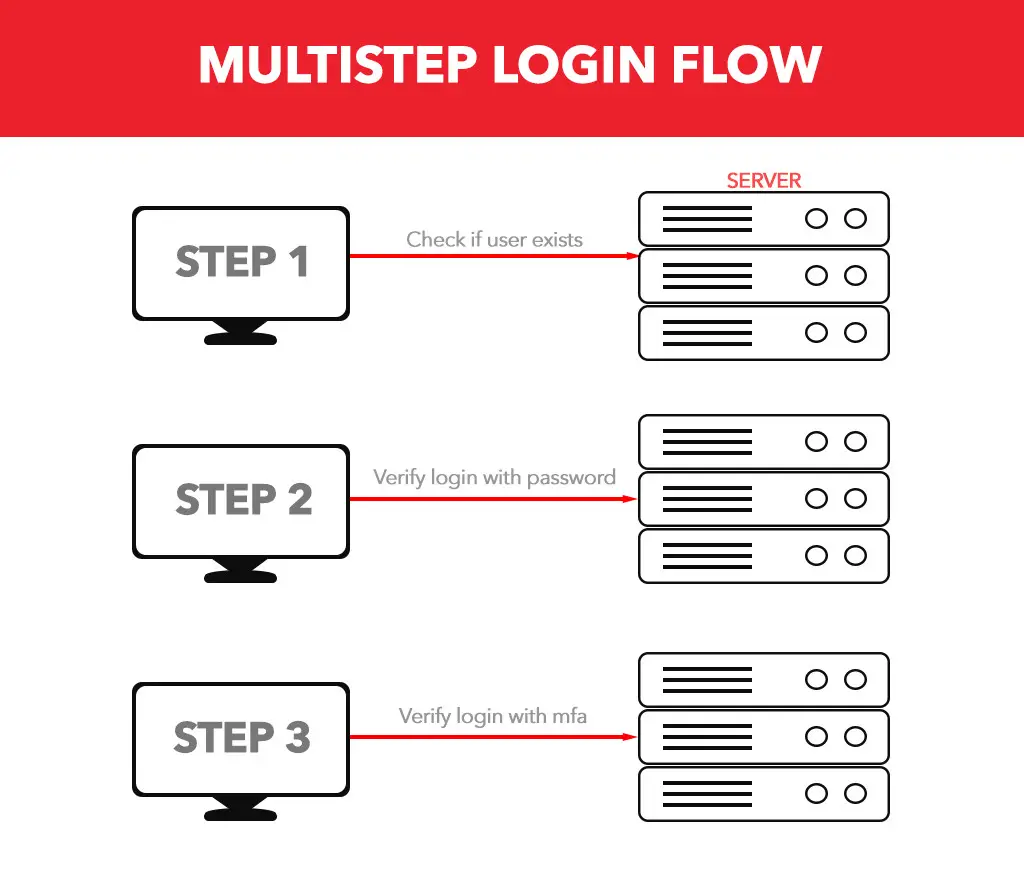
What is a multistep form?
A multistep form is a form presented to the user in steps. Appropriate for long fillables, preform checks at regular intervals and verify the authenticity ith recaptcha etc. Now-a-days web security is a growing concern and as a result, development standards are changing.
In this template, I've designed a multistep form with three steps. In first step, you can verify if the user ID exists, in second step, verify the password and in third step, ask the user to verify the 6 digit code sent to their email or mobile phone.
See DemoProcess
This template contains all the front-end design code you need. In the javascript, I've simulated the server response wait using setTimeout function. Replace it with ajax or fetch as per your requirement. If you would like get the code for it as well, see the form submission.
 To send multifactor authentication to email, follow this Otp With Nodejs tutorial
View code
.slider {
    vertical-align:top;
    display:inline-block;
    width:100%;
    transition: all 200ms linear;
  }
  #slideOuter {
    padding-right:3px;
    width:320px;margin:20px auto;
    white-space:nowrap;
    overflow:hidden;
  }
  .toggleStep_1 .slider {
    transform : translateX(-320px)
  }
  .toggleStep_2 .slider {
    transform : translateX(-640px)
  }
  #currentUser {
    text-overflow : ellipsis;
    overflow: hidden;
  }
  .mfa {
    width:40px;
    height:40px;
  }
<div id="slideOuter">
<div>
<div class="pb-2 text-center"><h1 class="h4">Login</h1></div>
<div id="customMessage" class='text-center text-danger'>
</div>
<div class="slider py-2">
<form onsubmit="event.preventDefault();verifyUser()">
<div class="form-floating mb-2">
<input type="email" class="form-control" id="userid" placeholder="name@example.com" required>
<label for="userid">Email address</label>
</div>
<div class="text-center">
<button id="nextButton" class="btn btn-primary w-100 btn-lg">
<span class="align-middle">Next</span>
</button>
<div class="visually-hidden" id="loadingSpinner1"><span class="spinner-border align-middle" role="status" style="font-size:6px"></span></div>
</div>
</form>
</div>
<div class="slider">
<div class="text-secondary px-2 py-2 text-center" id="currentUser"></div>
<form onsubmit="event.preventDefault();login(this)">
<div class="form-floating mb-2">
<input type="hidden" name="userid" id="currentUserid" />
<input type="password" name="password" class="form-control" id="password" autocomplete="current-password" placeholder="password">
<label for="password">Password</label>
</div>
<div class="text-center">
<button id="submitButton" class="btn btn-success w-100 btn-lg">
<span class="align-middle">Submit</span>
</button>
<div class="visually-hidden" id="loadingSpinner2">
<span class="spinner-border align-middle" role="status" style="font-size:6px"></span>
</div>
</div>
</form>
</div>
<div class="slider">
<div class="text-secondary px-2 py-2 text-center">Enter the 6 digit code sent to your email</div>
<form onsubmit="event.preventDefault();multiFactor(this)">
<div class="mb-4 mt-2 text-center">
<input type="text" class="text-center mfa" onkeyup="nextFocus(this,'mfa2')" name="mfa1" id="mfa1" required >
<input type="text" class="text-center mfa" onkeyup="nextFocus(this,'mfa3')" name="mfa2" id="mfa2" required>
<input type="text" class="text-center mfa" onkeyup="nextFocus(this,'mfa4')" name="mfa3" id="mfa3" required>
<input type="text" class="text-center mfa" onkeyup="nextFocus(this,'mfa5')" name="mfa4" id="mfa4" required>
<input type="text" class="text-center mfa" onkeyup="nextFocus(this,'mfa6')" name="mfa5" id="mfa5" required>
<input type="text" class="text-center mfa" name="mfa6" id="mfa6" required>
</div>
<div class="text-center">
<button id="verifyBtn" class="btn btn-info w-100 btn-lg">
<span class="align-middle">Verify</span>
</button>
<div class="visually-hidden" id="loadingSpinner3">
<span class="spinner-border align-middle" role="status" style="font-size:6px"></span>
</div>
</div>
</form>
</div>
</div>
</div>var nextBtn = document.getElementById('nextButton')
var loadingSpinner1 = document.getElementById('loadingSpinner1')
var loadingSpinner2 = document.getElementById('loadingSpinner2')
var loadingSpinner3 = document.getElementById('loadingSpinner3')
var slideOuter = document.getElementById('slideOuter')
var submitButton = document.getElementById('submitButton')
var verifyBtn = document.getElementById('verifyBtn')
var userid = document.getElementById('userid')
var password = document.getElementById('password')
function verifyUser(){
var uid = userid.value
document.getElementById('currentUser').innerText = uid
document.getElementById('currentUserid').value = uid
nextBtn.style.display = "none"
loadingSpinner1.className = 'my-4'
setTimeout( function(){
slideOuter.className = 'toggleStep_1'
}, 1000 )
}
function showMessage(msg){
var cmsg = document.getElementById('customMessage')
cmsg.innerText = msg
setTimeout( function(){ cmsg.innerText = "" } , 3000 )
}
/* Use this function to go back from step 2 to step 1
function goback(){
nextBtn.style.display = "inline-block"
loadingSpinner1.className = 'visually-hidden'
slideOuter.className = ''
}
*/
function login(e){
submitButton.style.display = "none"
loadingSpinner2.className = 'my-4'
setTimeout( function(){
slideOuter.className = 'toggleStep_2'
}, 1000 )
}
function multiFactor(e){
verifyBtn.style.display = "none"
loadingSpinner3.className = 'my-4'
}
function nextFocus(e,tgt){
if(!isNaN(e.value)) document.getElementById(tgt).focus()
else e.value = ""
}8. Tabbed Login
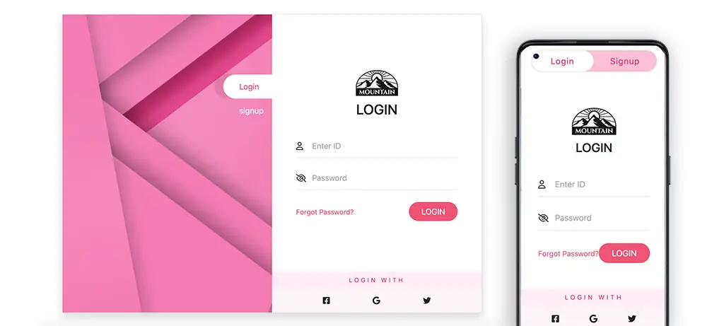
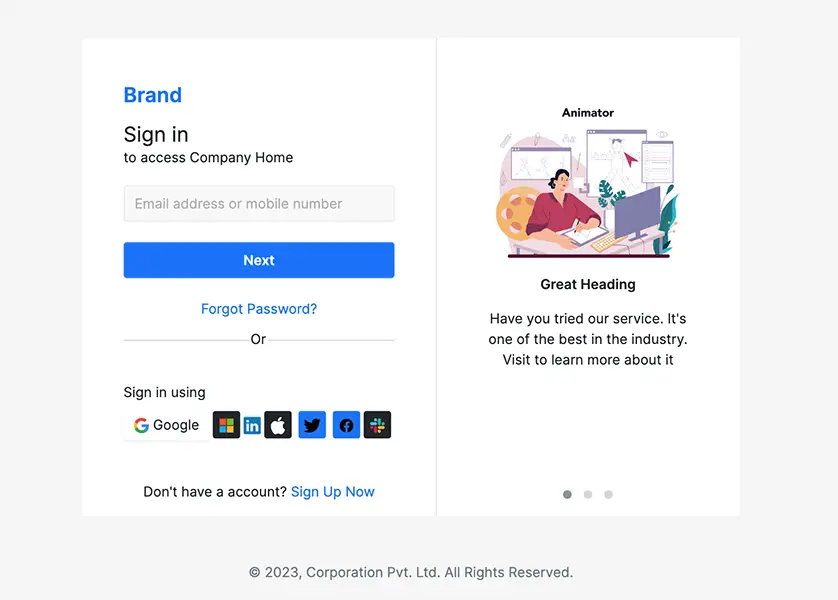
Pink themed login page with login and signup tabs. This page consists of two columns, one we use an abstract image and the other for the login form. The left column disappears at mobile screen breakpoint and a separate switch type tab appear to switch between login and signup.
View code
<div class="d-flex vh-100 justify-content-center align-items-center">
  <div class="p-2 flex-grow">
    <div class="smallContainer border shadow rounded">
      <div class="row g-0">
        <div class="col-sm-6 col-xs-12 d-none d-sm-block position-relative" id='leftCol'>
          <img src="/static_files/images/html/pinkAbs.jpg" />
          <div id="pt-5 text-end w-100" class="position-absolute end-0 top-0">
            <a href="#" class="customBtn activeBtn">Login</a><br />
            <a href="#" class="customBtn">signup</a>
          </div>

        </div>
        <div class="col-sm-6 col-xs-12">
          <div class="d-flex flex-column" style="height:100%">

            <div class="text-center d-sm-none d-xs-block">
              <div class="switch-button">
                <input class="switch-button-checkbox" type="checkbox"></input>
                <label class="switch-button-label" for=""><span class="switch-button-label-span">Login</span></label>
              </div>
            </div>

            <div class="my-auto p-5">
              <div class="text-center">
                <div>
                  <img src="/static_files/images/logos/logo_2.png" height="72" />
                </div>
                <h2 class="h3 pb-3">LOGIN</h2>
              </div>
              <form>
                <div class="position-relative my-3 inputGroup text-center">
                  <span class="position-absolute"><i class="far fa-user"></i></span>
                  <input type="email" class="border-0 border-bottom w-100" placeholder="Enter ID" />
                </div>
                <div class="position-relative my-3 inputGroup text-center">
                  <span class="position-absolute"><i class="far fa-eye-slash"></i></span>
                  <input type="password" class="border-0 border-bottom w-100" placeholder="Password" />
                </div>
                <div class="d-flex align-items-center justify-content-between pt-2">
                  <a class="linkFlare" href="#"><small>Forgot Password?</small></a>
                  <button class="btn btn-accent px-4 rounded-pill">LOGIN</button>
                </div>
              </form>
            </div>
            <div>
              <div class="p-2 text-center" id="lsHeading">
                LOGIN WITH
              </div>
              <div class="bg-accent-2 p-3 d-flex justify-content-evenly">
                <i class="fab fa-facebook-square"></i>
                <i class="fab fa-google"></i>
                <i class="fab fa-twitter"></i>
              </div>
            </div>
          </div>
        </div>
      </div>
    </div>
  </div>
</div>
.smallContainer {
max-width:840px;
margin:0 auto;
}
.inputGroup i {
line-height: 48px;
}
.inputGroup input{
padding-left : 32px;
height:48px;
outline: none;
}
#leftCol img{
width:100%;
object-fit: cover;
}
.customBtn {
color:#fff;
padding:12px 32px;
border-radius:32px 0px 0px 32px;
display:inline-block;
transform : translateY(120px);
text-decoration: none;
margin-right:-15px;
}
.linkFlare {
color: rgb(241, 82, 115);
text-decoration: none;
}
.btn-accent:hover{
background: rgb(244, 142, 163);
color:#fff;
}
.btn-accent {
background: rgb(241, 82, 115);
color:#fff;
}
::placeholder {
color : rgb(170, 170, 170)
}
.customBtn:hover,
.activeBtn {
color: rgb(241, 82, 115);
background:#fff;
box-shadow: -18px -1px 4px rgba(0,0,0,0.1);
}
#lsHeading {
letter-spacing:4px;
font-size:12px;
background: #ffecf4;
color : rgb(227, 43, 115)
}
.bg-accent-2 {
background : #fdf4f8
}
/* Custom Switch */
.switch-button {
margin: 10px auto;
border:1px solid #eaddda;
border-radius: 30px;
overflow: hidden;
width: 240px;
text-align: center;
font-size: 16px;
letter-spacing: 1px;
color: #fff;
background: #fbbdd5;
position: relative;
padding-right: 120px;
position: relative;
}
.switch-button:before {
content: "Signup";
position: absolute;
top: 0;
bottom: 0;
right: 0;
width: 120px;
display: flex;
align-items: center;
justify-content: center;
z-index: 3;
pointer-events: none;
color:rgb(227, 43, 115);
}
.switch-button-checkbox {
cursor: pointer;
position: absolute;
top: 0;
left: 0;
bottom: 0;
width: 100%;
height: 100%;
opacity: 0;
z-index: 2;
}
.switch-button-checkbox:checked + .switch-button-label:before {
transform: translateX(120px);
transition: transform 300ms linear;
}
.switch-button-checkbox + .switch-button-label {
position: relative;
padding: 8px 0;
display: block;
user-select: none;
pointer-events: none;
color:rgb(227, 43, 115);
}
.switch-button-checkbox + .switch-button-label:before {
content: "";
background: #fff;
height: 100%;
width: 100%;
position: absolute;
left: 0;
top: 0;
border-radius: 30px;
transform: translateX(0);
transition: transform 300ms;
}
.switch-button-checkbox + .switch-button-label .switch-button-label-span {
position: relative;
}9. Full Page Background
This login page is designed with a full page background appropriate for non textual images. The login form is aligned right with different sizes for different screen breakpoints.
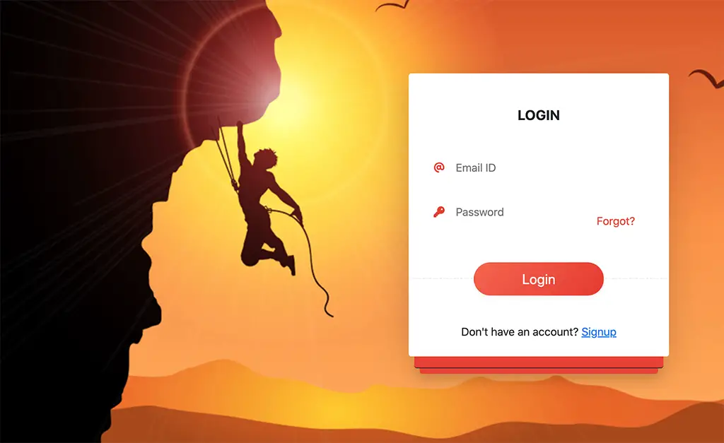
View code
<div id="pageContent">
  <div class="d-flex align-items-center h-100">
    <div class="container">
      <div class="row">
        <div class="col-xl-4 col-lg-5 col-md-6 col-sm-8 col-xs-12 ms-auto">
          <div class="bg-white rounded shadow-lg">
            <h1 class="text-center h5 pt-5 pb-3"><strong>LOGIN</strong></h1>
            <form class="py-2">
              <div class="position-relative maxWidth320 px-2">
                <div class="inlineLogo"><i class="text-accent fas fa-at"></i></div>
                <input type="email" placeholder="Email ID" class="border-0  w-100" />
              </div>
              <div class="position-relative maxWidth320 px-2 d-flex align-items-end justify-content-between">
                <div>
                  <div class="inlineLogo"><i class="text-accent fas fa-key"></i></div>
                  <input type="password" placeholder="Password" class="border-0  w-100" />
                </div>
                <div>
                  <button class="btn text-accent">Forgot?</button>
                </div>
              </div>
              <div id="submitBtn" class="text-center">
                <button class="btn w-50 btn-lg shadow-sm rounded-pill">Login</button>
              </div>
            </form>
            <div class="text-center pb-4">
              Don't have an account? <a href="#">Signup</a>
            </div>
          </div>
          <div class="p-2 mx-2 rounded-bottom shadow bg-accent border-bottom border-dark"></div>
          <div class="p-1 mx-3 rounded-bottom shadow bg-accent"></div>
        </div>
      </div>
    </div>
  </div>
</div>
#pageContent {
    background : url('/static_files/images/html/cliffHanger.jpg') no-repeat;
    background-size : cover;
    background-position: center;
    height:100vh;
    width:100%;
  }
  input {
    height:64px;
    outline : none;
    padding-left:32px;
  }
  .inlineLogo {
    position : absolute;
    line-height:64px;
  }
  .text-accent {
    color:#ea3f2d
  }
  .bg-accent {
    background-color:#ea3f2d
  }
  #submitBtn {
    margin-top:64px;
    margin-bottom: 32px;
    border-top : 1px dashed #eaeaea;
  }
  #submitBtn button {
    margin-top:-28px;
    /* Permalink - use to edit and share this gradient: https://colorzilla.com/gradient-editor/#f7644a+0,e73827+100 */
    background: rgb(247,100,74); /* Old browsers */
    background: -moz-linear-gradient(-45deg,  rgba(247,100,74,1) 0%, rgba(231,56,39,1) 100%); /* FF3.6-15 */
    background: -webkit-linear-gradient(-45deg,  rgba(247,100,74,1) 0%,rgba(231,56,39,1) 100%); /* Chrome10-25,Safari5.1-6 */
    background: linear-gradient(135deg,  rgba(247,100,74,1) 0%,rgba(231,56,39,1) 100%); /* W3C, IE10+, FF16+, Chrome26+, Opera12+, Safari7+ */
    filter: progid:DXImageTransform.Microsoft.gradient( startColorstr='#f7644a', endColorstr='#e73827',GradientType=1 ); /* IE6-9 fallback on horizontal gradient */
    color:#fff;
  }
  .maxWidth320 {
    max-width:320px;
    margin: 0 auto;
  }
10. Full Page Semi-Transparent
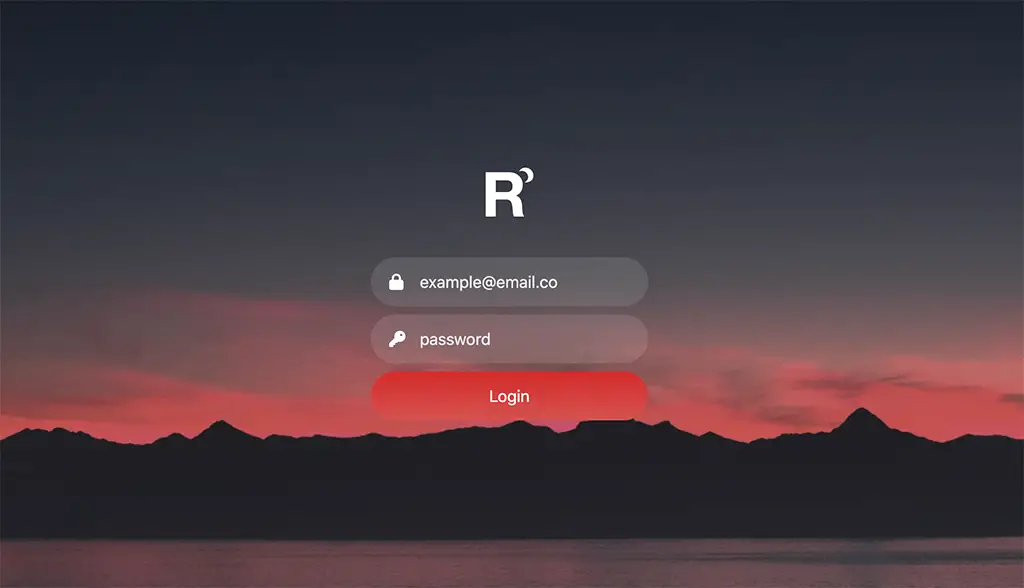
A page centered login form featuring a logo and a beautiful background. The background is chosen as such the mountains are aligned perfectly at the bottom of the form.
View code
<div class="vh-100 w-100 d-flex align-items-center" id="mainBgn">
  <div class="formContainer">
    <div class="text-center mb-4 pb-3">
      <img src="/static_files/images/logos/rockMoon.png" alt="Company Logo" height="48">
    </div>
    <form>
      <div>
        <span class="inputLogo"><i class="fas fa-lock"></i></span><input type="text" class="form-control rounded-pill" name="emailid" placeholder="example@email.co">
      </div>
      <div class="my-2">
        <span class="inputLogo"><i class="fas fa-key"></i></span><input type="password" class="form-control rounded-pill" name="password" placeholder="password">
      </div>
      <button class="btn btn-accent rounded-pill w-100" type="submit">Login</button>
    </form>
  </div>
</div>
.formContainer {
padding:24px;
width:100%;
max-width:320px;
margin:0 auto
}
.formContainer input {
height:48px;
padding-left:48px;
background: rgba(255,255,255,0.1);
border:none;
color:#fff;
}
.btn-accent:active {
box-shadow: 0px 0px 2px #D62822;
}
.formContainer input:focus {
box-shadow: 0px 0px 2px #D62822;
background: rgba(255,255,255,0.7);
}
.inputLogo {
position:absolute;
margin-top:12px;
margin-left:18px;
color : #fff
}
#mainBgn {
background : url('/static_files/images/html/dawn_2.jpg') no-repeat;
background-size: cover;
background-position: center bottom
}
.btn-accent {
background: rgb(214,40,34); /* Old browsers */
background: -moz-linear-gradient(top, rgba(214,40,34,1) 0%, rgba(216,82,76,1) 100%); /* FF3.6-15 */
background: -webkit-linear-gradient(top, rgba(214,40,34,1) 0%,rgba(216,82,76,1) 100%); /* Chrome10-25,Safari5.1-6 */
background: linear-gradient(to bottom, rgba(214,40,34,1) 0%,rgba(216,82,76,1) 100%); /* W3C, IE10+, FF16+, Chrome26+, Opera12+, Safari7+ */
filter: progid:DXImageTransform.Microsoft.gradient( startColorstr='#d62822', endColorstr='#d8524c',GradientType=0 ); /* IE6-9 */
height:48px;
color:#fff;
border:none;
}
.btn-accent:hover {
background: rgb(216,82,76); /* Old browsers */
background: -moz-linear-gradient(top, rgba(216,82,76,1) 0%, rgba(214,40,34,1) 100%); /* FF3.6-15 */
background: -webkit-linear-gradient(top, rgba(216,82,76,1) 0%,rgba(214,40,34,1) 100%); /* Chrome10-25,Safari5.1-6 */
background: linear-gradient(to bottom, rgba(216,82,76,1) 0%,rgba(214,40,34,1) 100%); /* W3C, IE10+, FF16+, Chrome26+, Opera12+, Safari7+ */
filter: progid:DXImageTransform.Microsoft.gradient( startColorstr='#d8524c', endColorstr='#d62822',GradientType=0 ); /* IE6-9 */
color:#fff;
}
::placeholder {
color: #ececec !important
}11. Neumorphic Page Centered
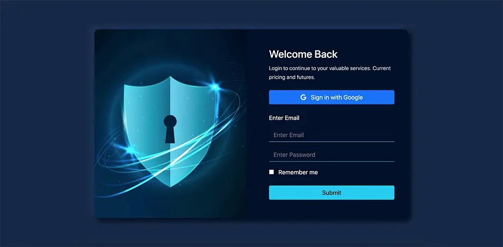
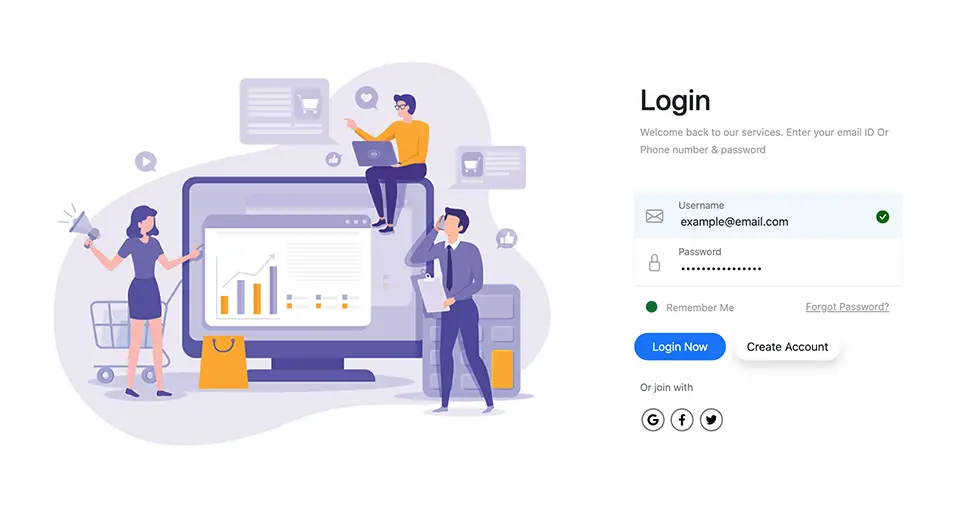
A this login page features a two columns with left column for the image and right colum for the login form. The left column is removed at xs breakpoint showing only the login form. The shadows are designed in such a way that it looks like a tablet which is basically a neumorphic design.
View code
<div class="container vh-100 d-flex align-items-center">
  <div id="innerPage">
    <div class="row align-items-center justify-content-center">
      <div class="col-sm-6 col-xs-12 d-sm-block d-none">
        <div id="imgBgn">
        </div>
      </div>
      <div class="col-sm-6 col-xs-12 text-white p-5">
        <div class="lead">
          <h3>Welcome Back</h3>
          <p class="fs-6 mb-4">
            <small>Login to continue to your valuable services. Current pricing and futures.</small>
          </p>
        </div>
        <button type="button" class="btn btn-primary w-100 text-white"><i class="fab fa-google me-2"></i> Sign in with Google</button>
        <div class="mt-4">
          <p>
            Enter Email
          </p>
        </div>
        <input class="form-control rounded-0 mb-3" type="Email" name="" placeholder="Enter Email" />
        <input class="form-control rounded-0 mb-3" type="password" name="" placeholder="Enter Password" />
        <div>
          <input type="checkbox" value="" class="me-2" id="flexCheckDefault">
          <label for="flexCheckDefault">Remember me</label>
        </div>
        <button class="btn btn-info mt-4 w-100" type="submit">Submit</button>
      </div>
    </div>
  </div>
</div>
body {
background:#162847
}
#innerPage {
width:100%;
max-width:840px;
margin : 0 auto;
border-radius: 12px;
background: #01102a;
box-shadow: 7px 7px 13px 1px #010b1e,
-10px -9px 11px 1px #1d335a;
}
.form-control {
background: none;
border:none;
border-bottom : 1px solid #45bdd9;
color:#fff;
}
#imgBgn {
background : url('/static_files/images/html/sheildFlare.jpg') no-repeat;
background-size: cover;
background-position:center;
min-height:75vh;
width:100%;
border-radius: 12px 0px 0px 12px;
}12. 3d Card
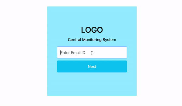
This is a multi step login system with 3d card flip style. The card flips when the user enters the ID and prompts to enter the password. A "go back" feature also exists. In the demo code, I've used setTimeout to create a delay for showing the loading button. This needs to be replaced with the server call (ajax or fetch).
View code
<div class="mt-5 pt-5">
  <div class="login-card rounded mx-auto ">
    <div class="login-card-inner" id="innerCard">
      <div class="login-card-front">
        <div class="p-4">
          <h2 class="h2">LOGO</h2>
          <p class="mb-3">
            Central Monitoring System
          </p>
          <form onsubmit="event.preventDefault()">
            <div>
              <input type="text" class="form-control" id="emailid" type="email" placeholder="Enter Email ID" autofocus>
            </div>
            <button class="w-100 mt-2 btn btn-info text-white" type="button" onclick="rotateCard(this)">
              Next
            </button>
          </form>
        </div>
      </div>
      <div class="login-card-back">
        <div class="p-4">
          <h2 class="h2">LOGO</h2>
          <p class="mb-3">
            Enter Password
          </p>
          <form onsubmit="event.preventDefault()">
            <div>
              <input type="password" class="form-control" id="password"  placeholder="Password" autofocus>
            </div>
            <button class="w-100 btn btn-success mt-2" onclick="login(this)">Login</button>
          </form>
          <div class="mt-2">
            <button class="btn" onclick="goBack()" id="goBackBtn">Go Back</button>
          </div>
        </div>
      </div>
    </div>
  </div>
</div>
.login-card {
background-color: transparent;
width: 360px;
height: 360px;
border: 1px solid #f1f1f1;
perspective: 800px;
}
.login-card-inner {
position: relative;
width: 100%;
height: 100%;
text-align: center;
transition: transform 0.8s;
transform-style: preserve-3d;
}
.rotateCard {
transform: rotateY(180deg);
}
.login-card-front, .login-card-back {
padding-top:50px;
position: absolute;
width: 100%;
height: 100%;
-webkit-backface-visibility: hidden;
backface-visibility: hidden;
}
.login-card-front {
background-color: #9defff;
color: black;
}
.login-card-back {
background-color: #85deb5;
color: white;
transform: rotateY(180deg);
}
form {
max-width:280px;
margin : 0 auto;
}
form button,
input.form-control {
outline : none;
box-shadow : none !important;
height:48px;
}function rotateCard(e){
e.innerHTML = `<span class="spinner-border spinner-border-sm me-2" role="status" aria-hidden="true"></span> Loading...`
e.disabled = true
// Remove this timeout and replace it with ajax functionality
setTimeout( function(){
document.getElementById('innerCard').classList.add('rotateCard')
e.innerHTML = "Next"
e.disabled = false
},2000 )
}
function login(e){
e.innerHTML = `<span class="spinner-border spinner-border-sm me-2" role="status" aria-hidden="true"></span> Loading...`
e.disabled = true
document.getElementById('goBackBtn').disabled = true
}
function goBack(){
document.getElementById('password').value = ""
document.getElementById('innerCard').classList.remove('rotateCard')
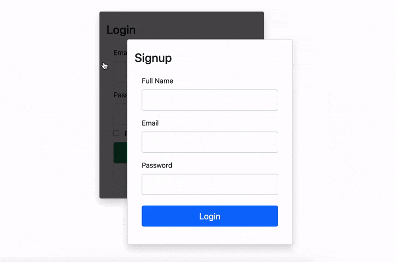
}13. Form Swap
Feature both login and signup forms on the same page which can be swapped by clicking on each form.
View code
<div class="vh-100 d-flex align-items-center">
  <div class="container">
    <div class="row">
      <div class="col-lg-5 col-md-6 col-sm-8 col-xs-10 mx-auto">
        <div id="loginFrame" class="position-relative">
          <div id="signup" class="levelDown shadow bg-white card p-3">
            <h3 class="my-2">Signup</h3>
            <form action="" method="" onsubmit="" class='mx-3 my-3'>
              <div class="mb-3">
                <label for="fullname">Full Name</label>
                <input type="text" class="mt-2 form-control" id="fullname" name="fullname">
              </div>
              <div class="mb-3">
                <label for="email">Email</label>
                <input type="email" class="mt-2 form-control" id="email" name="email">
              </div>
              <div class="mb-4">
                <label for="password">Password</label>
                <input type="password" class="mt-2 form-control" id="password" name="password">
              </div>
              <div class="mb-2">
                <button class="btn btn-lg btn-primary w-100">Login</button>
              </div>
            </form>
          </div>
          <div id="login" class="levelUp shadow bg-white card p-3">
            <h3 class="my-2">Login</h3>
            <form action="" method="" onsubmit="" class='mx-3 my-3'>
              <div class="mb-3">
                <label for="email">Email</label>
                <input type="email" class="mt-2 form-control" id="email" name="email">
              </div>
              <div class="mb-2">
                <label for="password">Password</label>
                <input type="password" class="mt-2 form-control" id="password" name="password">
              </div>
              <div class="mb-2">
                <input type="checkbox" class="me-2" for="rememeberMe"> <label for="rememberMe">Remember Me</label>
              </div>
              <div class="mb-2">
                <button class="btn btn-lg btn-success w-100">Login</button>
              </div>
              <div class="mt-4 text-center">
                <a href="">Forgot Password?</a>
              </div>
            </form>
          </div>
        </div>
      </div>
    </div>
  </div>
</div>
.form-control {
height:48px;
}
#loginFrame {
max-width : 420px;
width:100%;
margin:0 auto;
}
#login {
cursor:pointer;
}
.levelUp {z-index : 9;transform : translateX(32px) translateY(32px);transition:all 300ms linear;}
.levelDown {z-index : 8;transform : translateX(-32px) translateY(-32px);transition:all 300ms linear;}
#signup {
width:100%;
position:absolute;
}
.levelDown:after {
position:absolute;
content:" ";
width:100%;
height:100%;
left:0;
top:0;
background : rgba(0,0,0,0.7);
border-radius:4px;
}
.levelDown:hover:after{
cursor:pointer;
background : rgba(0,0,0,0.1);
}var signup = document.getElementById('signup')
var login = document.getElementById('login')
signup.onclick = function(e){
e.target.className = e.target.className.replace('levelDown','levelUp')
login.className = login.className.replace('levelUp','levelDown')
}
login.onclick = function(e){
e.target.className = e.target.className.replace('levelDown','levelUp')
signup.className = signup.className.replace('levelUp','levelDown')
}14. SVG Icons Login
Straying away from font awesome, I've downloaded the svgs from the bootstrap icons and designed this beautiful login page using bootstrap row, column and flex classes. The social icons are also svgs for which, I've designed custom pointer and active events using CSS.
View code
<div class="vh-100 d-flex align-items-center">
  <div class="container">
    <div class="row">
      <div class="col-lg-5 col-md-6 col-sm-8 col-xs-10 mx-auto">
        <div id="loginFrame" class="position-relative">
          <div id="signup" class="levelDown shadow bg-white card p-3">
            <h3 class="my-2">Signup</h3>
            <form action="" method="" onsubmit="" class='mx-3 my-3'>
              <div class="mb-3">
                <label for="fullname">Full Name</label>
                <input type="text" class="mt-2 form-control" id="fullname" name="fullname">
              </div>
              <div class="mb-3">
                <label for="email">Email</label>
                <input type="email" class="mt-2 form-control" id="email" name="email">
              </div>
              <div class="mb-4">
                <label for="password">Password</label>
                <input type="password" class="mt-2 form-control" id="password" name="password">
              </div>
              <div class="mb-2">
                <button class="btn btn-lg btn-primary w-100">Login</button>
              </div>
            </form>
          </div>
          <div id="login" class="levelUp shadow bg-white card p-3">
            <h3 class="my-2">Login</h3>
            <form action="" method="" onsubmit="" class='mx-3 my-3'>
              <div class="mb-3">
                <label for="email">Email</label>
                <input type="email" class="mt-2 form-control" id="email" name="email">
              </div>
              <div class="mb-2">
                <label for="password">Password</label>
                <input type="password" class="mt-2 form-control" id="password" name="password">
              </div>
              <div class="mb-2">
                <input type="checkbox" class="me-2" for="rememeberMe"> <label for="rememberMe">Remember Me</label>
              </div>
              <div class="mb-2">
                <button class="btn btn-lg btn-success w-100">Login</button>
              </div>
              <div class="mt-4 text-center">
                <a href="">Forgot Password?</a>
              </div>
            </form>
          </div>
        </div>
      </div>
    </div>
  </div>
</div>
.form-control {
height:48px;
}
#loginFrame {
max-width : 420px;
width:100%;
margin:0 auto;
}
#login {
cursor:pointer;
}
.levelUp {z-index : 9;transform : translateX(32px) translateY(32px);transition:all 300ms linear;}
.levelDown {z-index : 8;transform : translateX(-32px) translateY(-32px);transition:all 300ms linear;}
#signup {
width:100%;
position:absolute;
}
.levelDown:after {
position:absolute;
content:" ";
width:100%;
height:100%;
left:0;
top:0;
background : rgba(0,0,0,0.7);
border-radius:4px;
}
.levelDown:hover:after{
cursor:pointer;
background : rgba(0,0,0,0.1);
}var signup = document.getElementById('signup')
var login = document.getElementById('login')
signup.onclick = function(e){
e.target.className = e.target.className.replace('levelDown','levelUp')
login.className = login.className.replace('levelUp','levelDown')
}
login.onclick = function(e){
e.target.className = e.target.className.replace('levelDown','levelUp')
signup.className = signup.className.replace('levelUp','levelDown')
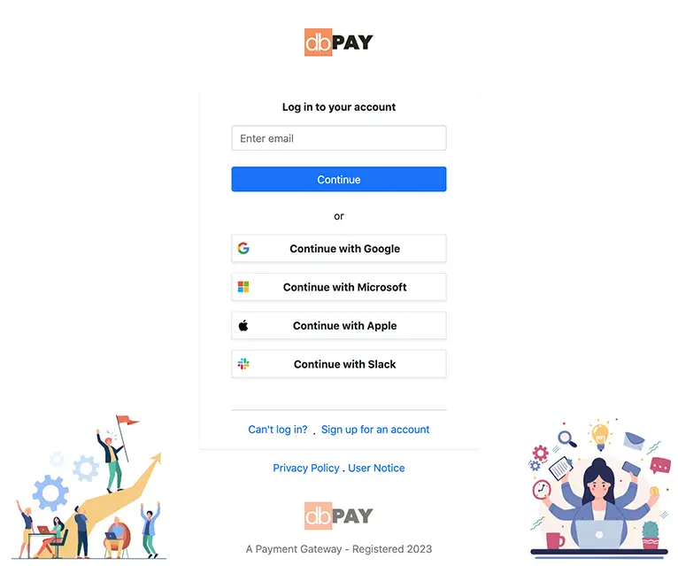
}15. Atlassian Login
Inspired from Altassian's Login. This login page features login with social media account. At the bottom, there are two images placed which adds more beauty to the login page. For the sake of responsiveness, they are removed from medium break point and down.
View code
<div>
    <div class="min-vh-100 d-flex flex-column justify-content-between">
        <div>
            <section class="text-center p-5">
                <img src="https://htmljstemplates.com/static_files/images/logos/dbPay.jpg" height="42px"
                    alt="DBook Logo">
                <!-- DBook -->
            </section>
            <div class="loginContainer shadow-sm text-center px-5 py-3">
                <p class="fw-bold">Log in to your account</p>
                <input class="form-control" name="textMessage" id="textMessage" type="text" placeholder="Enter email">
                <div>
                    <button class="btn w-100 btn-primary my-4 shadow-none">Continue</button>
                </div>
                <p>or</p>
                <div class="">
                    <button
                        class="border bg-white w-100 d-flex justify-content-between align-items-center p-2 my-3 shadow-sm fw-bold">
                        <img src="https://aid-frontend.prod.atl-paas.net/atlassian-id/front-end/5.0.410/static/media/google-logo.e086107b.svg"
                            alt="google-logo" height="18px">
                        <a class="text-decoration-none text-dark w-100" href="#">Continue with Google</a>
                    </button>
                    <button
                        class="border bg-white w-100 d-flex justify-content-between align-items-center p-2 my-3 shadow-sm fw-bold">
                        <img src="https://aid-frontend.prod.atl-paas.net/atlassian-id/front-end/5.0.410/static/media/microsoft-logo.42b61fa1.svg"
                            alt="Microsoft-logo" height="18px">
                        <a class="text-decoration-none text-dark w-100" href="#">Continue with Microsoft</a>
                    </button>
                    <button
                        class="border bg-white w-100 d-flex justify-content-between align-items-center p-2 my-3 shadow-sm fw-bold">
                        <img src="https://aid-frontend.prod.atl-paas.net/atlassian-id/front-end/5.0.410/static/media/apple-logo.4f2453fb.svg"
                            alt="Apple-logo" height="18px">
                        <a class="text-decoration-none text-dark w-100" href="#">Continue with Apple</a>
                    </button>
                    <button
                        class="border bg-white w-100 d-flex justify-content-between align-items-center p-2 my-3 shadow-sm fw-bold">
                        <img src="https://aid-frontend.prod.atl-paas.net/atlassian-id/front-end/5.0.410/static/media/slack-logo.0390f069.svg"
                            alt="Apple-logo" height="18px">
                        <a class="text-decoration-none text-dark w-100" href="#">Continue with Slack</a>
                    </button>
                </div>
                <hr class="m-0 mt-5">
                <div class="pt-3 align-top">
                    <a href="#" class="text-decoration-none">Can't log in?</a>
                    <div class="p-1 d-inline align-middle">.</div>
                    <a href="#" class="text-decoration-none">Sign up for an account</a>
                </div>
            </div>
            <footer>
                <p class="text-center pt-3"><a href="#" class="text-decoration-none">Privacy Policy</a> . <a href="#" class="text-decoration-none">User Notice</a></p>
            </footer>
        </div>
        <div class="mt-4" id="bottomCreds">
            <section class="text-center">
                <img src="https://htmljstemplates.com/static_files/images/logos/dbPay.jpg" height="42px"
                    alt="DBook Logo">
                <p class="mt-3">A Payment Gateway - Registered 2023</p>
            </section>
        </div>
    </div>
    <div class="position-fixed bottom-0 start-0 w-100">
        <div class="d-flex justify-content-between">
            <div>
                <img class="d-none d-lg-inline" src="./static_files/images/html/login_bottom_1.jpg" height="240px"
                    alt="Group of People in business">
            </div>
            <div>
                <img class="d-none d-lg-inline" src="./static_files/images/html/login_bottom_2.jpg" height="240px"
                    alt="multitask Activities">
            </div>
        </div>
    </div>
</div>
.loginContainer {
max-width: 420px;
margin: 0 auto;
}
.signOption {
text-decoration: none;
margin: 0 auto;
color: #000;
}
#bottomCreds {
opacity: 0.6
}16. Carousal Login
Inspired from zoho login. The login panel consists of two panels. Left panel is for login form and the right one is a carousal designed with the help of Owl carousal library.
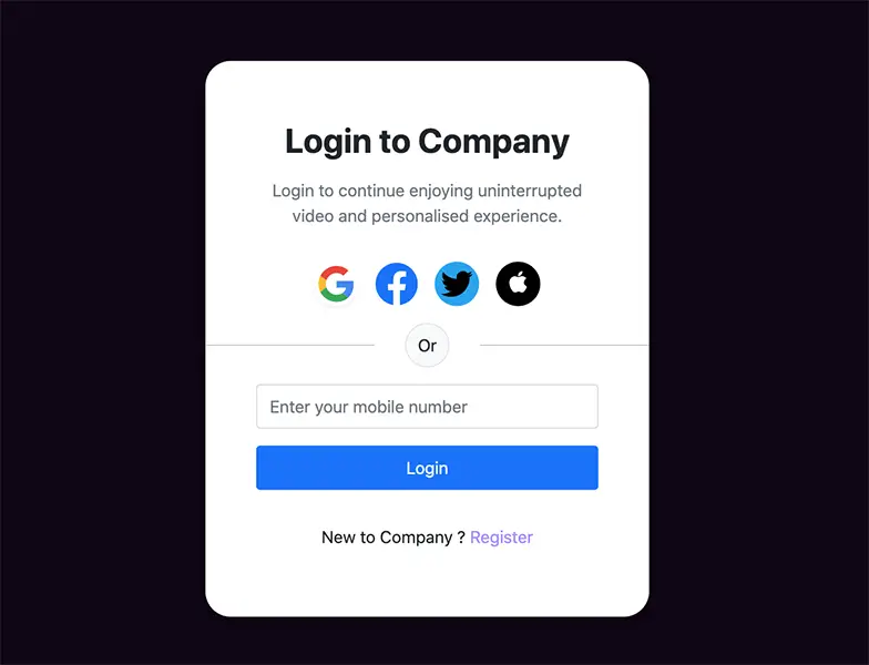
17. Social Login 2
This login is approprite for a streaming website. Login with social media accounts or a phone number. A simple login interface.
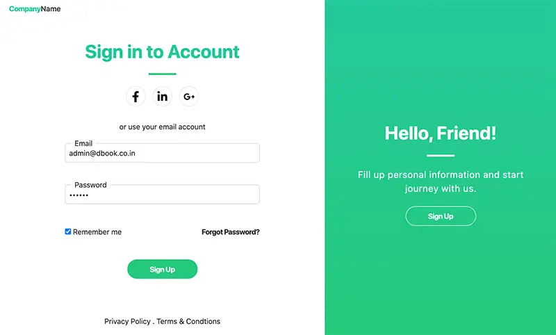
18. Login & Welcome Page
A two column responsive login page designed with bootstrap 5. Login with credentials, social media accounts and has provision for signing up on the same page
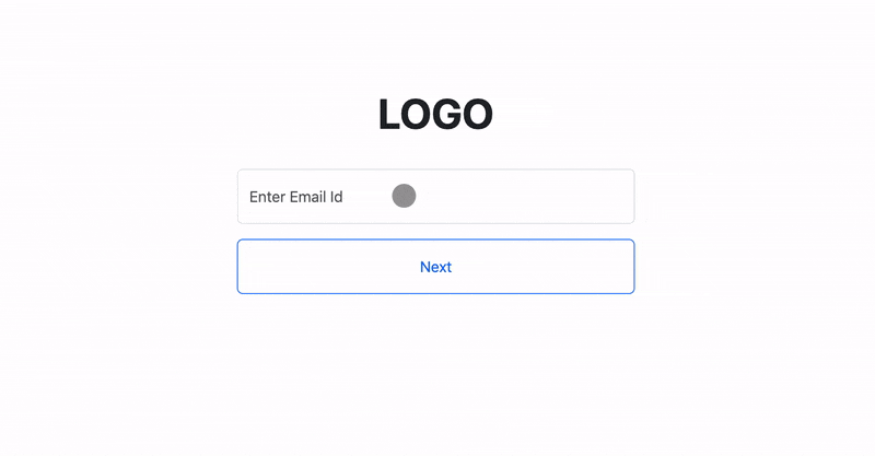
19. Swing Login
The is a multi-step login which can be used to pre-check the user ID existence. After the user ID is inputted, the password input field is swinged in. I've used greensock animation library to make the input swing and rock back.
 One of my readers "Amanda Gutierrez" has suggested a website for free icons, which I didn't even knew was existed. Check it out Here
Post a comment
Comments
Recent Posts

Webcam to CCTV
Do you want to access your webcamera remotely? Then this article is for you.
Calendar Picker
Calendar Picker / Appointment Setter JS CSS Library. Inspired by Calendly.
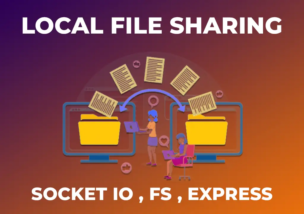
File Sharing Server
Create a local file sharing server with realtime sync feature using Socket IO.
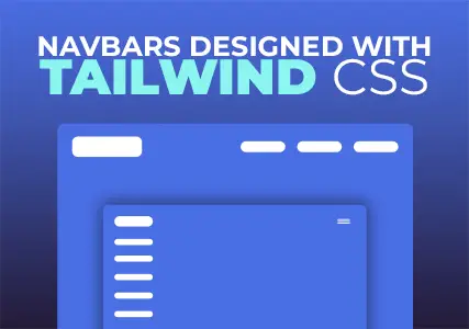
Tailwind Navbars
Most beautiful Navbars designed with tailwind css. Fully responsive templates.
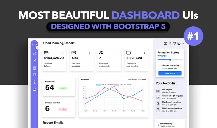
Dashboard UIs
Most beautiful dashboards designed with bootstrap 5. Inspired mostly from dribble and other sources.

HTML Email Tempaltes
Most commonly used HTML email templates. Welcome email, sign up, password reset etc.
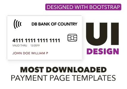
Payment Page UI
Checkout our most downloaded payment page ui designed with bootstrap.
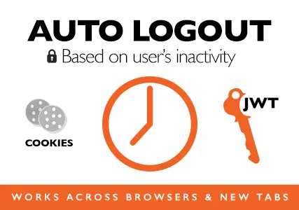
Auto Logout Feature
Detect user's inactivity and auto logout after certain timeout using various JS features.

HTML Popups
Keep the user engaged and gain recurring website traffic. Includes templates.
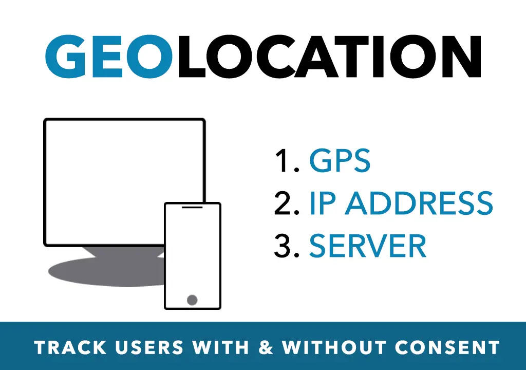
Geolocation
How to get a user's location using Javascript and other techniques available today.
Recent Utilities
- Numerology Calculator
- Invoice Builder
- Chatbot Builder
- QR Tickets
- WPNavbars
- Schema Generator
- Loading shimmer
- Day Planner
- Image Resizer
